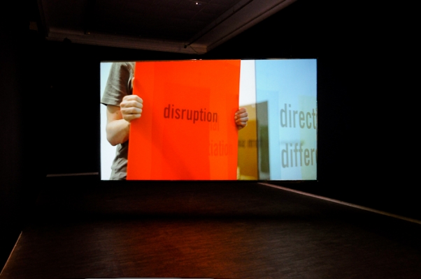
HD Video installation on two-way projection screen.
Looped, 4min 45sec.

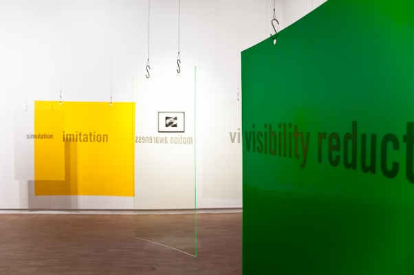
Installation view at Künstlerhaus

Installation view at Künstlerhaus


György Kepes (1938)

video projection with sound


Exhibition Reviews
By Barbara Kapusta on this is tomorrow
By Ivan Svoboda on Artycok.tv
------------
“Camouflage is the art of visual deception. And an understanding of the nature of visual deception demands an understanding of the fundamentals of visual perception.”
— John L. Scott, Laszlo Moholy- Nagy, and György Kepes
The point of departure for the exhibition up there down there is the physical and psychological states of orientation and disorientation within the built environment, and how the sensory experience of a city’s form affects ones ability to identify or distinguish oneself from it. The works in the exhibition respond to the artist’s engagement with contemporary urban planning programmes as well as with two specific figures within the modernist narrative of design and urban planning, namely György Kepes and Kevin Lynch.
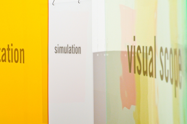
up there down there includes a video installation, a set of sculptures, and two historical artefacts. The sculptures are shown as an arrangement of curved plexiglass objects that demonstrate a scale of colours, tones and dimensions. Words such as “distortion”, “form simplicity”, and “visual scope” are printed on the objects. The vocabulary is drawn from Kepes’s “Principles of Camouflage” and Lynch’s “Form Qualities” and introduces the theme of complex viewpoints and an interplay between visibility and invisibility.
The room-size video installation features a continuous tracking shot in which the camera glides across the surfaces of the plexiglass sculptures. Alike the roving camera the sculptures are also set in motion by two figures moving through and arranging the filmed space. Accompanied by a four channel soundtrack that draws from the harmonics and cacophony of a dense cityscape, the installation becomes a shifting territory of sound, image and space. Perception of surface and space is translated and mediated from the city, to the printed page, to opaque and transparent plastics, to an illusionary two-way projection screen, a moving video image and a collaged soundscape.
Two historical artefacts link the artist’s interest in Kepes’ design theories to the subject of camouflage: a photograph by Kepes titled Juliet with Peacock Feather (1938) and an article titled “Civilian Camouflage Goes into Action” from Civilian Defense magazine (June, 1942) by John L Scott, Moholy-Nagy, and Kepes. The artist considers camouflage as a permeable layer or a lense between the two perspectives of space used for orientation: aerial view and street view. In drawing this connection, Croft poses the question, could city planning schemes, government marketing programmes or simply the certain architectural style of a city be considered a form of camouflage? And if so, what effect does this control of perception have on the camouflaged subject?
In 1942, Kepes was appointed by the U.S War Department to teach a course in urban camouflage techniques at the New Bauhaus in Chicago. For this challenge he literally subverted his theories of communication through design into miscommunication. In the 1960’s, Kevin Lynch applied Kepes’ notions of visual organisation to the urban environment in his thesis The Image of the City. Here he defined specific form qualities such as ‘form simplicity’, ‘directional differentiation’ or ‘visual scope’ as tools for the urban designer to mediate ones identification with ones surroundings.
up there down there functions on two levels: while the sculptures and video installation provided use the exhibition scenario as a modal for orientation and disorientation, the artefacts contextualise perception as something that is always designed and mediated. In this way, up there down there asks about the ramifications on the contemporary urban planning initiatives and the aestheticisation of identity within the city.